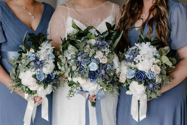
A blue and white wedding theme feels timeless without being locked into one look. Deep navy and crisp white can suit a black-tie ballroom, while dusty blue, ivory, and loose greenery feel right at home in a garden. At a beachside celebration, softer blues echo the setting without requiring seashells on every table. The secret is to choose a clear balance of shades, then repeat that balance across a few memorable details instead of making everything blue.
Choose the Right Blue and White Color Combination
Start with the mood you want guests to notice. Navy, bright white, and restrained gold accents read formal and tailored. French blue with cream feels romantic and traditional. Powder blue with white and natural wood looks airy for a summer wedding. Cobalt paired with clean white creates a striking, modern effect, especially when used in patterned ceramics or stationery.
Limit the main scheme to one dominant blue, one white or ivory, and one supporting neutral or metallic. Bring fabric samples and printed invitations into the reception space before committing; a pale blue that looks gentle in daylight may appear gray after sunset.
Adapt the Palette to Your Wedding Style
Formal and Classic
Build a classic wedding theme around navy wedding colors, white flowers, polished glassware, and candlelight. Navy napkins against white tablecloths offer strong contrast without darkening the room. Silver flatware feels cool and traditional; warm gold makes the same combination more glamorous.
Coastal and Summer
For a coastal wedding, favor washed blue linens, white blooms, rattan accents, and uncomplicated place settings. Blue-and-white stripes can work beautifully on cocktail cushions or escort-card displays, but use them sparingly to avoid a nautical costume effect.
Garden and Traditional
Dusty blue ribbons, antique-style china, ivory linens, and leafy floral arrangements create a softer interpretation. A few blue-and-white patterned vessels can connect the tables to the stationery.
Set the Tone at the Ceremony
The ceremony needs only a few deliberate touches. White flowers with blue ribbon on aisle chairs look beautiful against greenery. Alternatively, frame the vows with two generous arrangements containing white roses, hydrangeas, or seasonal blooms, then carry those arrangements to the reception if your florist and venue can manage the move safely.
A blue feature may disappear against a dark wall but stand out against pale stone. If the venue already has handsome architecture, a white floral arrangement and subtle blue fabric may have more impact than a large decorative structure.
Make Flowers Feel Natural, Not Forced
True blue flowers are less common than white blooms, and availability varies by region and season. Blue hydrangeas, delphiniums, and certain thistles may be options, but ask your florist what is locally practical and suitable for the arrangement.
One effective approach is to use mostly white flowers with small blue accents and greenery. It keeps bouquets fresh-looking and gives the blue room to stand out. If a particular blue bloom is expensive or unavailable, use blue silk ribbons, ceramic vessels, or printed details instead of artificially coloring every flower.
For more floral inspiration, explore wedding bouquet color combinations that suit both structured and loose arrangements.
Build Reception Tables Around Contrast
Blue white wedding decor looks strongest when every layer has a purpose. Begin with white tablecloths as a clean backdrop, then introduce blue through napkins, menus, or runners. If the venue already supplies attractive white linens, that is an easy place to save money. A blue goblet or patterned plate can act as a focal point without requiring matching accessories at every seat.
Imagine a reception for 80 guests seated at ten round tables. Instead of purchasing ten expensive blue tablecloths, keep the venue’s white linens and choose blue napkins, modest white centerpieces, and navy table-number cards. Repeat the same blue on the seating chart near the entrance.
For blue reception decor after dark, check how the scheme looks under warm artificial lighting. Test one complete place setting during a venue visit if possible. Candlelight softens navy beautifully, while very pale blue may need brighter table lighting to remain visible. Keep flames clear of fabrics and follow venue rules for candles.
Carry the Theme Into Stationery, Attire, and the Cake
Invitations are often the first clue to the celebration’s style. Navy lettering on white card is crisp and easy to read. A delicate blue border or watercolor wash can hint at a garden setting, while a blue-and-white monogram looks polished for a formal event.
Attire should coordinate rather than match perfectly. Navy suits, blue bridesmaid dresses, or blue accessories can support the palette, but there is no need to impose a single fabric color on every member of the wedding party. Compare swatches in natural light and allow small tonal differences, especially across different materials.
A white wedding cake with restrained blue piping, ribbon-inspired sugar details, or a floral accent usually photographs more gracefully than a cake crowded with decorations.
Keep the Look Cohesive Without Overspending
Choose three high-visibility moments: the ceremony backdrop, dining tables, and entrance display. Spend where guests will notice the result and where photographs will capture it. Smaller areas, such as restroom baskets and miscellaneous signage, can remain neutral. Reusing ceremony flowers and selecting one consistent shade of blue often creates a better result than buying more decorative pieces.
Before ordering, put images of your linens, flowers, invitations, and tableware side by side. Remove anything that introduces a competing blue or an unrelated pattern. For planning ideas that fit the budget, look at affordable wedding centerpiece ideas and wedding reception table settings. A cohesive palette depends more on editing than on quantity.
Frequently Asked Questions
What colors go well with blue and white for a wedding?
Ivory, champagne, silver, soft gold, and natural greenery all work. Choose just one or two supporting accents based on your venue and the shade of blue. Navy with gold feels dressier; pale blue with greenery feels lighter.
Is a blue and white wedding theme suitable for every season?
Yes. Pale blue, white, and fresh greenery are particularly appealing in spring and summer. Navy, ivory, and candlelight suit autumn and winter celebrations. Fabric texture, flowers, and lighting do as much seasonal work as color.
How can I use blue without making the reception too dark?
Let white or ivory dominate large surfaces, and place blue on smaller elements such as napkins, menus, ribbons, and table numbers. Add good ambient lighting and reflective glassware where appropriate.
Do all bridesmaid dresses and decorations need to match?
No. Use a shared reference swatch and repeat one anchor shade in the stationery or table details to tie everything together.
A Timeless Look With Room for Personality
The most successful blue and white wedding theme is recognizable without being rigid. Choose a blue that suits the venue, give white space to breathe, and repeat a handful of thoughtful details from the ceremony to the reception. That approach creates the classic elegance couples love while leaving room for their own style.